
Nail Art Color Combination Ideas That Actually Work
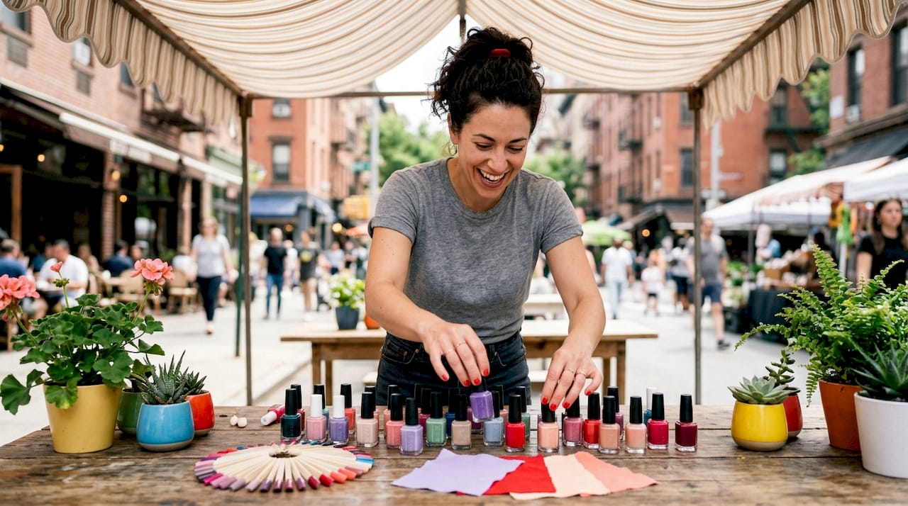
The most effective nail art color combination ideas come from applying structured color theory, not guesswork. Professionals rely on three core frameworks: complementary, analogous, and neutral-grounding schemes built on the 12-position color wheel. Value contrast, the difference in lightness and darkness between colors, determines whether a design pops or disappears. Skin tone harmony ensures the final look flatters rather than clashes. On the small scale of a nail, every color decision is amplified, which makes understanding these principles the difference between a striking manicure and a muddy one.
1. What are the fundamental nail art color combination ideas from color theory?
Color combinations for nail art follow three primary frameworks: complementary, analogous, and neutral-grounding schemes. Each produces a distinct visual effect, and knowing which to use gives you creative control from the start.
Complementary schemes pair colors directly opposite each other on the 12-position color wheel. Blue and orange, red and green, purple and yellow. These pairings create maximum contrast and visual energy. They work best when one color dominates and the other serves as an accent.
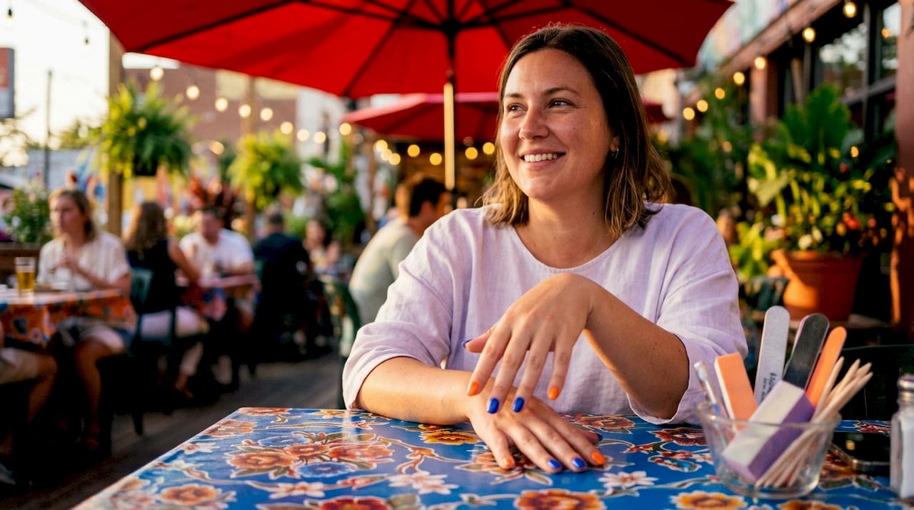
Analogous schemes use colors sitting next to each other on the wheel. Think coral, peach, and warm pink together. The result feels harmonious and cohesive. This is the go-to approach for soft, wearable nail color schemes that still show creativity.
Neutral-grounding schemes anchor bold or saturated colors with a neutral base, such as nude, white, gray, or black. The neutral prevents the design from feeling chaotic. A vivid cobalt blue paired with a warm beige base is a classic example of this technique in action.
Complementary: blue and orange, red and green, purple and yellow
Analogous: coral, peach, warm pink; or teal, blue, navy
Neutral-grounded: bold accent color plus nude, white, or black base
Triadic: three colors equally spaced on the wheel, such as red, blue, and yellow for a playful, balanced look
Pro Tip: Start with one dominant color covering at least 60% of the design, then use your second color for 30%, and your accent for the remaining 10%. This ratio keeps even bold combinations from looking overwhelming.
2. How value contrast shapes your nail design
Value contrast is the biggest factor in whether a nail design pops or disappears. Value simply means how light or dark a color is, independent of its hue.
High value contrast pairings, like black and white or navy and cream, create graphic, high-impact looks. The eye reads the design instantly. Low value contrast pairings, like sage green on mint, produce subtle, blended effects that feel soft and understated.
The most common mistake is pairing two colors with nearly identical values. A dusty rose on a light blush base, for example, can make detailed nail art vanish at arm’s length. The design exists, but no one can see it.
Color Pair | Value Contrast | Visual Effect |
Black and white | Very high | Graphic, bold, high-impact |
Navy and cream | High | Classic, clean, readable |
Sage and mint | Low | Soft, blended, subtle |
Dusty rose and blush | Very low | Washed-out, design disappears |
Red and nude | Medium | Balanced, flattering, wearable |
Accent nails and thin outlines are the fastest way to introduce contrast without redesigning the whole look. A single black outline around a colored shape immediately separates it from the base. Background color also shifts perceived value. A medium gray reads darker on a white base and lighter on a black base.
Pro Tip: Photograph your nail design in black and white on your phone before finishing. If the design disappears in grayscale, the value contrast is too low and the colors will blend together in real life.
3. How to choose nail colors that flatter your skin tone
Most people select nail colors by instinct, but professionals rely on understanding undertones to achieve a flattering result. Skin tones fall into two broad categories: warm (yellow, golden, or peachy undertones) and cool (pink, red, or bluish undertones). Matching your nail color’s undertone to your skin’s undertone creates a cohesive, lifted look.
The fastest professional method is the Swipe Test. The Swipe Test technique involves holding color samples against the inside of your wrist and observing which shade makes your skin look brighter and more alive. Colors that make the skin look dull or sallow are the wrong undertone match.
Warm skin tones look best with: coral, peach, terracotta, warm red, gold, caramel, and earthy nudes
Cool skin tones look best with: berry, mauve, true red, icy pink, lavender, navy, and cool-toned nudes
Neutral skin tones can wear both, making them ideal candidates for bold complementary schemes
Lighting conditions change how nail colors read on skin. A shade that looks perfect under salon lighting can shift under office fluorescents. Checking color under 5500K daylight lamps ensures the color holds true across different environments. For a deeper guide on matching shades to your specific complexion, this skin tone color guide walks through the process in detail.
4. Expert techniques for layering and blending nail colors
Layering is where nail art color combinations become truly personal, but it is also where most designs go wrong. The rule professionals follow is simple: limit designs to three colors maximum to prevent a muddy, chaotic result. Every color added beyond three competes for attention and muddies the overall palette.
Creating gradients and ombré effects
Sponge application is the standard method for color gradients. Paint two or three colors in overlapping stripes on a makeup sponge, then dab it onto the nail in a rolling motion. The colors blend at the contact points while staying distinct at the edges. For a full walkthrough of gradient styles, the ombré nail art guide at Bradentonnails covers current 2026 variations in detail.
Layering sheer over opaque
Sheer colors layered over opaque bases create depth without adding visual noise. A sheer pink over a white base reads differently than the same pink over a nude base. The opaque layer controls the final tone, while the sheer layer adds dimension.
Mixing custom gel colors
When mixing custom gel shades, start with the lightest color and add darker pigments gradually. Adding dark to light gives you control. Adding light to dark wastes product and risks streaks. Always test a cured swatch in natural light before applying the mix to a full nail, since gel colors can shift during curing.
The Two-Tone Rule adds depth beyond color alone. Apply a glossy top coat to the base and a matte top coat over the nail art layer. The contrast in finish creates a dimensional effect that makes the design look more intentional and polished.
Pro Tip: Test your blended colors under natural light before committing to the full design. Colors that look balanced under warm indoor lighting often reveal unwanted undertones in daylight.
5. Trendy nail color combinations to try right now
The strongest nail art inspiration in 2026 leans into bold contrast and deliberate color pairing, moving away from the all-over pastel looks that dominated recent years. The combinations below work because each one applies at least one of the core frameworks: complementary contrast, analogous harmony, or neutral grounding.
Red and nude: A timeless complementary-adjacent pairing. The nude grounds the red and keeps the look wearable for any occasion.
Black and white: Maximum value contrast. Works as geometric patterns, French tips, or abstract art.
Lavender and sage green: An analogous cool-tone pairing that feels fresh and modern without being loud.
Cobalt blue and warm gold: A complementary scheme with a metallic twist. High impact for special occasions.
Peach and terracotta ombré: Analogous warm tones that blend naturally. A strong choice for summer nail color ideas.
Mint and white with black outlines: Neutral-grounded with high contrast outlines. Clean, graphic, and easy to execute.
Burgundy and dusty rose: A tonal pairing with medium value contrast. Ideal for fall and winter seasonal nail color ideas.
Neon yellow and black: Maximum contrast with a bold, graphic edge. One of the strongest trendy nail combinations for 2026.
Spring calls for pastel analogous pairings. Summer rewards vibrant complementary contrasts. Fall and winter favor deep, neutral-grounded schemes with rich jewel tones. Rotating your palette with the seasons keeps your nail art feeling current without requiring a complete rethink of your approach.
Key Takeaways
The most effective nail art color combinations apply complementary, analogous, or neutral-grounding schemes alongside value contrast and skin tone harmony to create designs that are both striking and personally flattering.
Point | Details |
Use a color theory framework | Choose complementary, analogous, or neutral-grounding schemes before picking shades. |
Prioritize value contrast | Pair colors with different lightness levels so designs stay visible and graphic. |
Match undertones to skin tone | Use the Swipe Test to find shades that lift your complexion rather than dull it. |
Limit layering to three colors | More than three colors in one design creates muddy, competing results. |
Test under natural light | Check blended or cured colors in daylight to catch unwanted shifts before finishing. |
Color theory changed how I see nail art
Most people treat nail color like an outfit accessory, picking whatever looks good in the bottle. I did the same thing for years. What changed my approach was learning that value contrast, not hue, is what makes a design readable. You can have the most beautiful color pairing on paper, but if both shades sit at the same lightness level, the design vanishes at arm’s length.
The other shift was realizing that frameworks are not restrictions. Knowing that cobalt and orange are complementary colors does not mean every design has to be textbook. It means you have a starting point. You can push the orange toward terracotta, pull the blue toward teal, and the underlying tension still works because the structure is sound.
My honest advice: learn the three frameworks, practice the Swipe Test on your own wrist, and stop picking colors in artificial light. Those three habits will improve your nail art more than any new technique or product. The creative expression comes after the foundation is solid.
— MinhHieu
Professional nail art color expertise at Bradentonnails
Getting color combinations right takes practice, and having a skilled technician who understands color theory makes the process faster and more satisfying.
At Bradentonnails, the nail artists in Bradenton, FL apply the same complementary, analogous, and neutral-grounding principles covered here to every custom design. Whether you want a subtle analogous blend, a high-contrast graphic look, or a seasonal ombré, the team works with your skin tone and style preferences to build a combination that flatters. Bradentonnails offers manicure services across West Bradenton, Palmetto, and Ellenton, with flexible hours including Sundays. For long-lasting color combinations, the SNS dipping powder service delivers rich, chip-resistant color that holds its depth for weeks. Book online and bring your color ideas.
FAQ
What are the three main nail art color combination frameworks?
The three main frameworks are complementary, analogous, and neutral-grounding schemes, all based on the 12-position color wheel. Each produces a distinct visual effect, from high-contrast graphic looks to soft, harmonious blends.
How do I stop my nail art colors from looking muddy?
Limit your design to three colors maximum and test blended shades under natural light before applying them fully. Starting with the lightest color and adding darker pigments gradually also prevents streaks and unwanted mixing.
What nail colors work best for warm skin tones?
Warm skin tones are most flattered by coral, peach, terracotta, warm red, and caramel nudes. The Swipe Test, holding shades against the inside of your wrist, confirms which colors lift your complexion.
Why does value contrast matter more than color choice?
Value contrast determines whether a nail design is visible at a normal viewing distance. Two colors with similar lightness levels will blend together and make detailed art disappear, regardless of how different their hues are.
How do I create an ombré effect at home?
Paint two or three colors in overlapping stripes on a makeup sponge, then dab it onto the nail in a rolling motion. The colors blend at the contact points while staying distinct at the edges, producing a gradient effect.
Recommended
Comments